May sale is liveEnds in
Get upto 30% discount on trending certification courses. Apply Now
This course training is available on request only. Send us your request with preferred date & Time & our training advisor will get back to you within 24 business hours.
This course builds upon the concepts covered in Captivate – Beyond the Essentials. In this course you will explore how to create responsive projects that adapt to fit any screen size, whether it be mobile, tablet or desktop. With mobile learning becoming a large percentage of eLearning, it is important to understand how to adapt your projects to this new environment.
You begin by exploring the responsive interface within Captivate. You then take a look at the HTML5 environment and its benefits and limitations. You move on to create custom breakpoints and adapt project content to accommodate these breakpoints. You will learn how to control themes, styles, and content for various screens sizes. You will learn the benefits of using smart positioning for content when building projects for multiple screen sizes. You will explore how to modify non-responsive content to adapt to a responsive design. Finally, learn how to take advantage of tools for testing responsive projects.
This course is for people who have been using Captivate and want to build responsive Captivate projects that automatically adapt to fit the screen size of the device whether it be mobile, tablet or desktop.
 Live Interactive Learning
 Lifetime Access
 24x7 Support
 Hands-On Project Based Learning
 Industry Recognised Certification
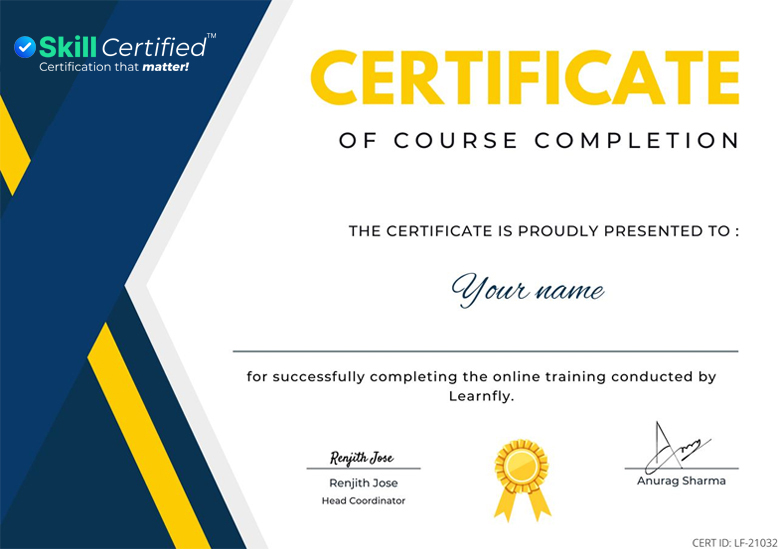
Get a e-Certificate of Course Completion after successfully completing your live class with SkillCertified™. Share & showcase your proud achievement with your friends & colleagues. Join a live class today & start learning online from anywhere:
